Logos are arguably the most essential part of any brand identity. They build brand recognition and awareness in the present, and they can endure long into the future.
Think about McDonalds. If the global fast food giant closed today, generations of people would remember its logo.
While aiming for a McDonalds level of success might be a little bit out of reach…there’s nothing stopping logos you design from being unforgettable. You just need these 7 essential logo design tips!
What is a logo?
A logo is a symbol that is used to identify a brand, usually positioned with the brand name. The colouring, wording and design of the symbol combine to create something that acts as a unique signature for the brand it represents.
An effective logo will show the personality of the brand and give an indication of what services or products it provides. Another key component of a logo is its ability to stand out and be recognisable.
7 essential logo design tips
Here are the 7 essential logo design tips that will take your logo design skills to the next level.
1. Research your competitors
That’s right. Before you even consider drawing something, see what’s out there before you sink your teeth (and your time) into something. It is devastating to finish a logo and realise later that you’ve accidentally copied an existing design. Then it’s quite literally back to the drawing board!
Unintentional copyright infringements aside, you also want your logo to stand out from your competition, not blend in. As the saying goes, zig when others zag. If you notice your competitors all gravitate towards literal logos, go for something abstract, or vice versa.
2. Consistency is key
When we say consistency, this applies to more than just the logo. Whether the brand design or the logo comes first is a little like the chicken or the egg conundrum – it doesn’t matter as long as both relate to each other.
If you’re asking, “what came first, the cow or the egg?”, you’ve got a problem!
The logo and overall brand design, such as the website, should all carry the same elements and have the same goal in mind. Otherwise, it’s confusing for your consumers. They should be able to recognise your brand no matter what form it’s in.
3. Scalability
A big challenge for graphic designers is making a logo that represents who their clients currently are, but also who they will become.
Picture a newly founded catering company. Right now it’s just a couple who can manage a job or two a week. The temptation might be to design something cute and personal. Afterall, their clients are going to use them for a homemade, personal touch, not because of their reputation.
Now let’s consider the client’s intentions for the future. They’re expecting a cash injection in the next 18 months, after which they want to take catering more seriously. This will include:
- Hiring employees
- Buying vehicles
- Branded merchandise
- Branded uniforms.
Armed with this new information, you’ll need to make a logo that is more authoritative to represent the larger scale of their operation. They don’t want to seem like they’re only capable of children’s birthday parties!
Anytime you design a logo for a client, always keep its scalability for their future plans in mind.
4. Easy to reproduce
Another essential logo design tip is making sure your logo is reproducible for digital, print and physical display.
For example, let’s return to our fictional catering company. Their logo might need to be displayed on:
- Their website
- Emails
- Business cards
- Painted vans
- Uniforms
- Napkins and tablecloths
- Billboards or store fronts
That means the logo needs to be appropriate for different screen sizes and resolutions, as well and legible on different printed and stitched surfaces. That’s a lot to consider!
To protect yourself from creating something that can’t be used in different ways, avoid:
- Fonts that are too intricate or thin
- Having too many complicated or overlapping designs
- Using too many different colours
By avoiding these pitfalls, you can make sure your client can use their logo for any applications now, and in the future.
5. Know when to be abstract or literal
Each graphic designer has different skills and preferences in their artwork. Some will naturally lean more towards being abstract, and others will prefer more literal designs.
While there are no hard or fast rules about whether a logo should be abstract or literal, a good logo design tip is to be more abstract when selling feelings or an experience. That’s because it’s hard to visually represent a benefit that isn’t physical.
For example, a tourism company’s logo might be waves on a beach. This is communicating the benefit rather than literally explaining the service itself. This is because it’s much easier to show how a holiday will make a person feel, than it is to show tourism as an industry.
On the other hand, literal logos are perfect for easily recognisable products and services. Got a client who runs an autoshop? Easy! Use something like a car, wheel or road as a visual cue. Job done!
6. Less is more
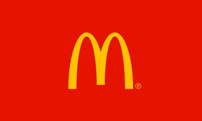
At the start of this article, we mentioned McDonalds as an example of a timeless logo. But let’s actually analyse what it contains and see why.
At first you might be thinking, “there’s really nothing to it, why is it so popular?”
You’ve actually answered your own question.
The gold and red colours match the brand colours, and are the hero of the image. The M, or ‘golden arches’, resemble fries, a signature product. The logo has the courage to let the brand speak for itself, without adding unnecessary elements.
It understands the concept of less is more.
Of all the logo design tips in this list, less is more is one that graphic designers can struggle to perfect. The design process is a wonderful, messy, experimental one. But sometimes that needs to be reigned in to make something truly efficient, clean and powerful.
7. Don’t redesign your logo
Wait, what?
Our last logo design tip is to…not design?
Yes, and it might just be the most important one. Think about each logo design tip so far.
- Different from competitors? ✅
- Consistent with the rest of the brand? ✅
- Designed so it can scale with future growth? ✅
- Easy to reproduce in different formats? ✅
- Abstract or literal to match the brand purpose? ✅
- Minimally designed to just have the key information? ✅
If the logo ticks all these boxes, what is the benefit of changing it?
Generally speaking, logos should only change once every 10 years. If a brand changes considerably, you may break this rule. But if you find yourself changing a logo every couple of years you need to consider something.
It’s natural for the owner of a logo to dislike it over time. After seeing it every day it will lose its appeal and seem less ‘perfect’.
But for customers, everytime you change, you risk losing their brand recognition. This can be a sure-fire way to lose business and loyal customers.
So next time you get asked to redesign a logo, ask why. If it ain’t broke, don’t fix it!
Use a professional graphic design service
If you’ve used all these logo design tips but you still need some help, have you considered enlisting the help of a professional graphic designer?
Our graphic design team creates incredible looking logos and branding for our clients. Get in contact today to transform your own logo into something that perfectly captures your brand.
If you’d like to see more of our work, or learn more about our services, visit our website.