4 Seasons Insulation has been a retainer client with Oddball for over six years. Their business provides commercial and residential insulation installation and removal services on the Central Coast, and throughout much of NSW.
Their service relies on a steady supply of insulation stock, as well as operating assets like trucks, tools, pumps, installation equipment and office supplies.
That’s why their business was devastated when a fire destroyed the majority of those assets.
The Fire
On January 15 this year, a severe fire broke out at 2/8 Sailfind Place, Somersby. At the time, this premises housed both the 4 Seasons head office and the warehouse, though thankfully the manufacturing plant was located separately.
All of their stock, several installing trucks and most of their office equipment were lost in the fire.
“Thankfully, no one was there at the time. We can rebuild our stock, but to lose one of our team would have been truly devastating.” said 4 Seasons Managing Director Jade Nicoll.
While thankfully 4 Seasons were able to continue servicing their customers, the fire had been a major event in the history of their business. It gave them time to reflect, and time to consider the things that they had been postponing.
Like a full rebrand.
The Initial Discovery
The logo is, by design, the most eye-catching and memorable image associated with a business. That’s why it was the basis of the initial discovery meeting regarding the 4 Seasons rebrand.
Oddball Creative Director Keiran Hartley had been eager to do a logo redesign for quite some time. “It was something we’d discussed with the client and looked at a couple of times over the years but were never satisfied,” he said.
He felt that there were a few issues that were holding the logo back from really communicating the personality of the 4 Seasons brand.
“The original logo had a very strangely angled and drop-shadowed ‘4’ as the hero, set over ‘3’ recycling style arrows! The Microgramma font was also very wide and large and the word ‘seasons’, in contrast, was microscopic.” said Keiran.
Unlike the previous discussions, both parties were determined to create a design that they were happy with once and for all.
The Goal of the Rebranding Exercise
When Keiran sees a logo that he doesn’t believe is living up to its full potential, his eye starts twitching.
That’s because, first and foremost, Keiran cares about the exercise, explaining that “It’s always our desire to distil the essence of a business down to its simplest and most accessible visual form.”
This sentiment is even more true for 4 Seasons, who are friends with key personnel at Oddball. “We were familiar with the existing brand, but the tone of the business has matured over time as it has expanded. We wanted the new brand to reflect that.” Keiran said.
Given the severity of the fire and the significance of the rebrand, the stakes were high to get it right.
The Process
The first task was to update the logo. Once this step was complete, the concept for the rest of the website would be established.
Step 1
The main issue with the logo was the number ‘4’ that acted as the hero word. It was retooled several times, as well as being shrunk or enlarged. In an attempt to strike a balance with the word ‘seasons’, both were also enlarged in comparison to each other.
When this failed to bear fruit, the four words, ‘4’, ‘seasons’, ‘home’ and ‘insulation’ were trialled in different configurations. This led to an important realisation.
Step 2
While 4 Seasons had originally started as a largely residential service, they have increasingly commissioned commercial projects over the years. Keiran decided that not only was the word ‘home’ superfluous – it had in fact become misleading.
Removing it killed two birds with one stone, as it also significantly reduced how ‘busy’ the logo looked.
Step 3
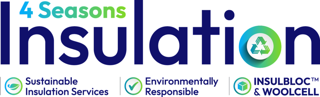
The final breakthrough was the decision to retire the ‘4’ as the hero of the logo. The team felt that ‘insulation’ made more sense as it described the product itself, plus as the longest word it naturally balanced the logo when it was placed in the centre.
Step 4
With the text positioning finalised, attention turned to the recycling symbol. While the three arrows was a difficult design to work with, the symbol itself is important to the 4 Seasons brand identity. Eventually, the decision was made to incorporate it as the ‘o’ in insulation.
Step 5
Now that the configuration and style of the new logo was complete, the colours needed to be considered. Given 4 Season’s proud focus on environmentalism and sustainability, the red didn’t suit the brand.
The decision was made to keep the blue, but replace the red with green, and make them both lighter. Once the new colours were decided, the entire website could be recoloured to follow suit.
Rebranded and a Reborn
While they would have rather not suffered a business disruption to inspire a rebrand, in the case of 4 Seasons, this is exactly what happened.
What started as a small family owned business has now become a highly respected and highly sought after Central Coast brand. In many ways, the fire signified the shedding of that old skin, and the embracing of a new look and feel.
Keiran is very proud of the 4 Seasons that has risen from the ashes, saying that “The result is a classic, modern brand that carries the recycle aspect from the original brand and replaces reds with “environmental” greens.”
“It is very legible and communicates friendliness along with accessibility, professionalism and environmental care. I think it perfectly sums up everything that 4 Seasons is about.” he said.

The most rewarding aspect of the work we do at Oddball is hearing the client’s reaction.
Thankfully, Jade was very happy with the results, “It has been a very challenging period for 4 Seasons but I was really excited to work with Oddball to recreate a new direction and purpose for the business.” she said.
“It would have been easy to shut the doors and walk away after what we endured the last couple of years (between bushfires, COVID, staff shortages, stock issues, price increases, floods and “the fire”), however, if you have a team around you like Oddball you’re inspired to rise to the challenge. I am also extremely lucky to have amazing staff and suppliers who have contributed to getting us through difficult times, I can’t thank everyone enough.” Managing Director Jade Nicoll said.
To see the rebranding in action, please visit the 4 Seasons Insulation website.
If your own brand needs a refresh, why wait?
Your logo is the most important graphical element of your business, and you want it done professionally to create the best and most lasting impression. For more information, see our website.
Contact us today to enlist the service of our graphic design experts.